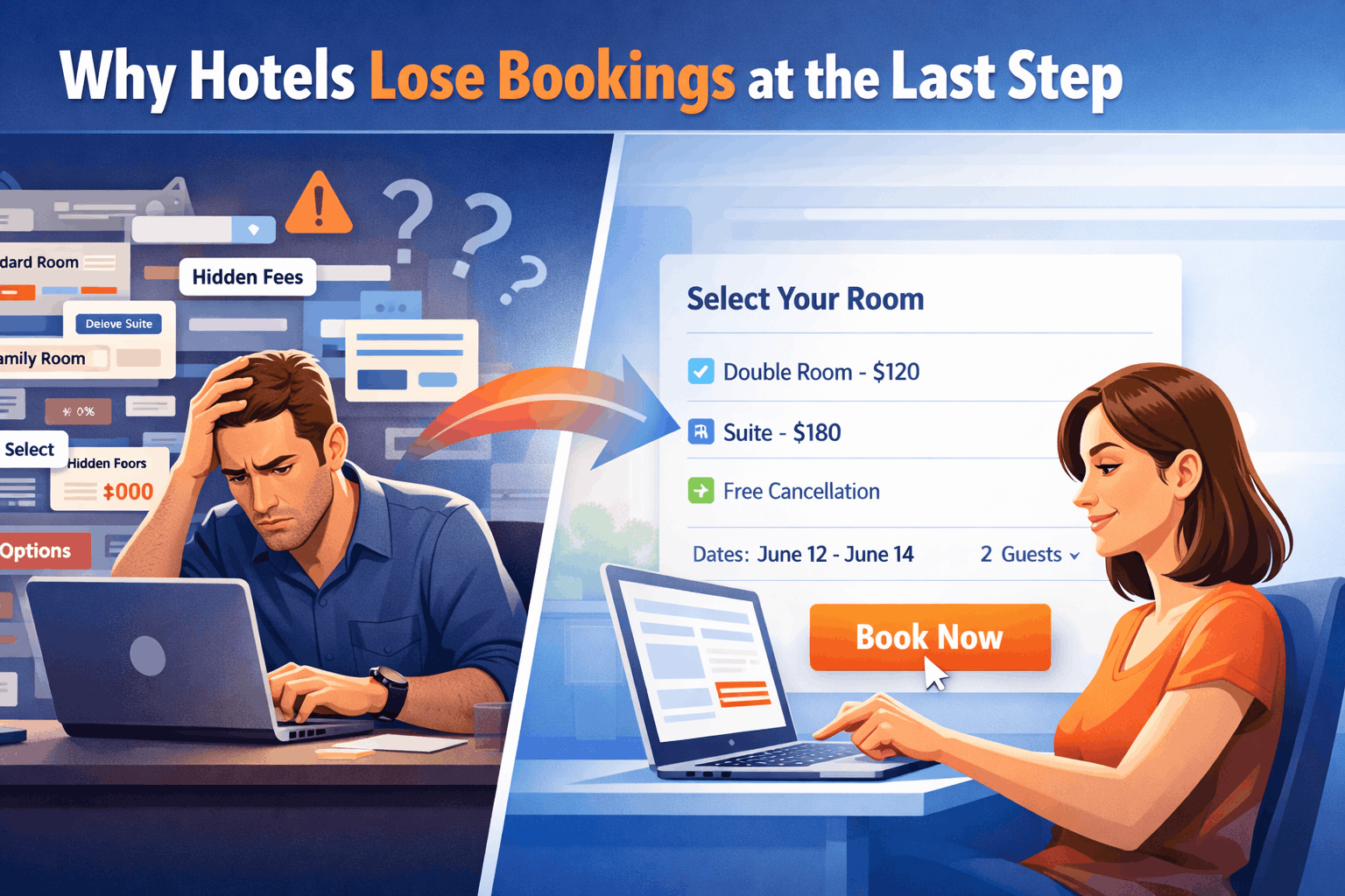
A guest lands on your hotel website.
They click “Book Now.”
At that moment, something important has already happened:
the decision to stay with you is nearly made.
This isn’t discovery.
This isn’t inspiration.
This is conversion.
And yet-this is exactly where many hotels lose the booking.
Not to competitors.
Not to pricing.
But to friction.
The Myth: “OTAs Steal Our Customers”
It’s easy to blame online travel agencies like Booking.com or Expedia Group.
They have massive marketing budgets, global reach, and strong brand recall.
But in the final step of the booking journey, they’re not stealing your guests.
You’re sending guests to them.
Here’s how it happens:
- A guest visits your website
- They click “Book Now”
- They hesitate
- They open a new tab
- They search your hotel name
- They book through an OTA
The intent didn’t disappear.
It just got redirected.
The Reality: Intent Exists-But Confidence Doesn’t
By the time a guest reaches your booking engine, they’re already convinced about:
- The destination
- The property
- The general price range
What they’re not fully confident about is:
- Which room to choose
- Which rate to pick
- Whether they’re making the “right” decision
And this is where most hotel booking experiences fail.
Where Hotel Booking Journeys Break Down
1. Too Many Room Types That Feel the Same
“Deluxe Room”
“Premium Deluxe Room”
“Executive Deluxe Room”
To an internal team, these distinctions make sense.
To a guest?
They create uncertainty.
When differences aren’t obvious, guests assume risk:
“What if I pick the wrong one?”
And when risk increases, conversion drops.
2. Rates That Require Interpretation
“Flexible Rate”
“Semi-Flexible Rate”
“Advance Purchase Rate”
These labels force guests to stop and think.
- What’s the cancellation policy?
- Is breakfast included?
- Is the discount worth the restriction?
Instead of moving forward, the guest pauses.
And hesitation is dangerous at this stage.
3. Irrelevant Packages That Distract
“Romantic Getaway Package”
“Spa Retreat Offer”
“Stay 3 Pay 2”
These can be powerful earlier in the journey.
But at checkout?
They often feel like noise.
The guest came to book a room—not to re-evaluate their entire stay.
4. Decision Fatigue at the Worst Moment
Every additional choice adds cognitive load.
By the time a guest reaches the final steps, they’ve already:
- Compared hotels
- Checked reviews
- Evaluated prices
Their mental energy is low.
And instead of simplifying the final step, many hotel websites increase complexity.
Why OTAs Win This Moment
Platforms like Booking.com and Expedia Group are designed for one thing:
Fast, confident decisions.
They reduce friction in critical ways:
Clear Structure
- Fewer confusing labels
- Easy-to-scan options
- Strong visual hierarchy
Built-In Reassurance
- Guest reviews
- “Only 2 rooms left” messaging
- Clear cancellation policies
Decision Shortcuts
- “Best Value” tags
- “Most Popular Choice” highlights
- Price comparisons made obvious
They don’t eliminate choice.
They organize it so the decision feels easy.
The Core Problem: Hotels Optimize for Information, Not Decisions
Most hotel booking engines are designed to:
- Display inventory
- Show all available rates
- Maximize visibility of offers
But guests don’t want more information.
They want clarity.
There’s a critical difference:
- Information answers questions
- Clarity removes doubt
And in the final step of the booking journey,
removing doubt matters more than anything else.
The Real Cost of Friction
Across many hotel websites, a significant portion of booking intent-often over 40%-drops off in the final steps.
Not because guests changed their minds.
But because:
- The process felt complicated
- The decision felt risky
- Another option felt easier
That “another option” is often an OTA.
How Hotels Can Win Back the Final Step
This isn’t about competing with OTAs on scale.
It’s about outperforming them in experience.
1. Reduce Room Type Complexity
- Group similar rooms
- Highlight key differences only
- Use plain language (e.g., “Best for families,” “City view”)
2. Simplify Rate Choices
- Focus on 2–3 clear options
- Make differences obvious
- Explain policies in one line, not paragraphs
3. Guide the Decision
Don’t just list options-recommend one.
- “Most Popular Choice”
- “Best Value for 2 Nights”
- “Flexible & Risk-Free”
Guests appreciate direction.
4. Remove Last-Step Distractions
At checkout, prioritize:
- The selected room
- The selected rate
- A clear path to payment
Everything else is secondary.
5. Build Confidence, Not Pressure
Instead of overwhelming guests, reassure them:
- Clear cancellation terms
- Transparent pricing
- Trust signals (reviews, ratings, guarantees)
Confidence converts better than urgency alone.
A Simple Truth
If a guest leaves your website at the final step, it’s rarely because:
- Your hotel isn’t good enough
- Your price isn’t competitive
It’s because:
The decision didn’t feel easy enough to complete.
Final Thought
Hotels don’t lose bookings to OTAs at the end of the journey.
They lose them in the experience of deciding.
The guest already chose you.
The question is:
Did your booking flow help them say yes-or make them think twice?


